Most portfolios look like templates because they are templates. Same hero, same three-column grid of cards, same "Hi, I'm X" above a stock illustration. The work might be brilliant. The site says "I picked a theme."
This is how I build a personal site that does the opposite. It is the method behind the one you are reading. No framework worship, no 60-section landing page. One idea, executed with restraint.
TL;DR
- Build an editorial magazine, not a landing page. Type, space, and restraint do the heavy lifting.
- Earn attention with exactly one signature interaction that could only belong to you. Make everything else quiet so it sings.
- Treat performance as design. On a slow phone in Accra, a beautiful site that loads in eight seconds is an ugly site.
- Verify by looking, not by "it builds." Screenshot the real thing on a real phone, then fix what you see.
1. Decide what the site is for
A portfolio has one job: make the right person believe one thing about you. Before any code, write that sentence down.
"A physician who builds the systems his institutions run on." That is a different site from "a designer who sweats every pixel," which is a different site from "an operator who ships." The sentence decides the typography, the tone, the one interaction, and what you cut.
If you cannot say it in a line, the site will say nothing in a thousand.
2. Editorial over landing page
The default portfolio is a landing page: hero, features, social proof, call to action. It reads like a product nobody asked for.
Build a magazine instead. Magazines trust the reader. They use a strong masthead, generous margins, a confident headline, and long quiet stretches. They do not shout. The reference points that age well are editorial sites, not SaaS templates.
Practically, that means:
- A real masthead (wordmark, a thin nav, a date or issue line), not a sticky bar of buttons.
- A type system with one display face and one text face, sized with intent. Most amateur sites die on flat, undersized type.
- Whitespace as a feature, not a gap to fill. The empty half of the screen is doing work.
- A warm, specific palette with a single accent, plus a real dark theme. Two themes, both designed, not one inverted by a plugin.
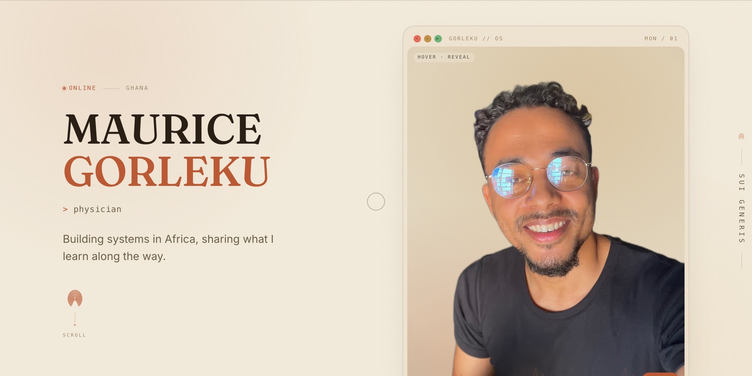 The whole site is restrained so one element can carry it.
3. Find your one signature interaction
This is the part that cannot be bought. A signature interaction is a single bespoke element that is you, that a visitor remembers and a template could never ship.
For a physician who builds systems, it is a "diagnostic monitor": a portrait framed as a tiny operating system, with a heartbeat line, working window controls, and a hidden game. It rewards the curious and says, without a word, "this person builds things."
Find yours by finishing this sentence: "the thing I do that nobody else in my field does is ____." Then build the smallest interactive expression of it. A writer might get a living manuscript that rewrites itself. A musician, a waveform you can play. A trader, a ticker that tells a story.
Rules for the signature:
- Exactly one. Two signatures is zero signatures. Everything else on the page stays calm so this one moment lands.
- On-brand, not on-trend. It should map to who you are, not to whatever animation library is popular this quarter.
- Degrade gracefully. It must be fine with no JavaScript, fine with reduced motion, and fine on a touch screen with no hover.
4. Restraint is the technique
Once you have the signature, your main job is to protect it. The most common failure is a site where the headline scrambles, the background drifts, the cursor trails, and the hero animates, all at once. The eye has nowhere to rest, so nothing reads as special.
Pick the one moment. Make the headline simply confident. Let the scroll be smooth and the reveals subtle. The discipline of leaving things out is what separates a designed site from a decorated one.
5. Performance is part of the design
A portfolio is judged in the first three seconds, often on a mid-range Android on a slow network. If your signature interaction costs three seconds of load, you have built a worse site, not a richer one.
The rules that keep it fast without making it boring:
- One priority image is the hero. Everything else is lazy. The largest thing on first paint should be a real, optimized image, and nothing should compete with it for bandwidth.
- Gate the expensive stuff behind intent. Heavy reveals load on hover (desktop) or when they scroll into view (mobile), never on first paint. The phone should not download what it will never show.
- Serve modern formats. AVIF and WebP, sized to the device. A 1.5MB hero PNG is a design decision, and a bad one.
- Guard every animation with reduced motion. It is an accessibility requirement and a taste signal.
The bar I hold: a mobile performance score in the 90s with the hero image as the largest paint. You can have the craft and the speed. You just cannot fake the speed.
6. Verify by looking
The single most important habit, and the one almost everyone skips: look at the actual rendered page. A green build proves your code compiled. It proves nothing about whether a photo is sideways, a caption overlaps a button, the contrast is unreadable, or the whole interaction is dead on a phone.
So drive the real site with a headless browser, perform the real interaction (hover, tap, scroll), screenshot the element, and read the image. Do it on a desktop and a 390px phone, in light and dark. Every visual defect I have ever shipped was invisible in code review and obvious in a screenshot.
Build it, then go and look at it. On a phone. In the dark.
7. Identity in the details
The last 10 percent is where bespoke shows. Draw your brand marks as line-art SVG that inherits the text color, so they adapt to light and dark for free and cost nothing to load. A small repeated motif (a thumbprint, a heartbeat, a sigil) ties the masthead, the dividers, and the footer into one object. Avoid pasting a copyrighted logo or a stock icon set. Stylize the idea instead.
The checklist
- One sentence: who must believe what.
- Editorial layout: masthead, type system, whitespace, two designed themes.
- Exactly one signature interaction, bespoke to you, degrades gracefully.
- Everything else restrained so the signature lands.
- Priority hero image, lazy everything, modern formats, reduced-motion guards.
- Mobile performance in the 90s, hero image as the largest paint.
- Verified by looking: desktop and phone, light and dark, real interactions.
- Line-art brand marks and one repeated motif.
A portfolio is not a list of what you did. It is a small, fast, memorable proof of how you think. Build the proof.
Written from the build of this site. Stack: Next.js, Tailwind, GSAP, and a lot of screenshots.